Category Archives: Photography

General photography natter — gear, thoughts, ideas, and the odd photo.

Hey — Look at Those Photos!

Yup, I finally have the photo archive running again!  After almost a month of coding, I have scripts for my workflow now that will make putting new images on the web a cinch.  Enjoy!

I’ll be putting the scripts up here later through the week.  I wanna describe the functionality in pretty good detail.  It’ll be worth the wait.  🙂

Living the Dream

Last night, Lenny invited me to visit Jim Trotter.  Jim is a St. Louis-based photographer, working out of his home.  His specialties seem to be model shoots as well as architectural photography, and his images are spectacular.

Jim’s studio was astounding!  There were works covering the walls, enormous printers capable of printing images on canvas or printing images several feet wide, and a spacious shooting studio.  Jim was kind to us, indulging us with some insight into his workflow — using a PowerMac, Wacom tablet and Photoshop as his tools… all familiar friends to me.  He also showed off some of his gear.  He shoots a lot of large and medium format film as well as digital medium format.  I was really impressed with the resolution of the images that he produces with this gear.  He’s able to enlarge images to fantastic dimensions, all because he starting with such a large source image.

And then there was his home.  It was filled with artwork in progress.  Every room had something that either he or Joyce (his wife) were working on.  Aside from the home being beautiful, it was an extension of the two of them and of the studio, a reflection of travels and experience.  What people hang on their own walls is a window into their soul, and from the looks of their walls, this couple really enjoys their work and passion.

Jim told me about a local artist group, ArtDimensions, that happens to be meeting tonight.  I think I’ll go downtown tonight, and check them out.  It sounds like a great opportunity to get some of my work exhibited in town, and gain a little exposure that I wouldn’t otherwise have had.

I hold no illusion that I’ll be shooting at Jim’s level — that’s a far reach! — and I don’t expect to be shooting models.  It’s not what Jim’s photographing that’s the dream, it’s the fact that he is neck-deep in his photographic work, day in and day out.  For me, the dream is working at something that you’re passionate about, something that’s personally rewarding and satisfying.  The dream is creating art that can touch someone, and elicit a positive emotion from them, maybe brightening their day just a little.

That’s living the dream, and I will live it one day.

Too Much Silence Means Too Much Coding

And in my case, it means too little playing too!  🙂

I’m still working on the problem of a quick-and-dirty workflow for my photos once I come back from a shoot (or vacation, or whatever).  Ideally, I just wanna group ’em by date and topic, quickly tag ’em, and shove ’em out to the web so my two biggest fans can see ’em.

The grouping and tagging I have to do manually — no way around that.  The PowerMac is good, but it’s not clairvoyant.  I’m resigned to having to do this work, and it really doesn’t take that long.  A week’s vacation will take 30-60 minutes of work.  No biggie.

The challenge has been how to get the images out on the web in the photo archive.  I started running into problems with this process in November.  Prior to then, most of what I’d shot was in JPG format; now I shoot almost exclusively RAW.  It’s better for post-processing, and is terrific for all the other things I wanna do with my images.  But….. (there’s always a but, eh?)  JAlbum doesn’t speak RAW.  I’ve been working with testing a plugin that would handle RAW images, but it really is designed for RAW images other than Canon.  Bummer.

That leaves me with some thoughts about options. 

I can use Photoshop CS2 to build my photo pages.  This is not my first choice.  I have too much time invested in my JAlbum skin, look and navigation to go to something else.

I can use Lightroom to build my photo pages.  This is appealing, but I’m not sure I really like the albums it puts together.  They are snazzy, but they are also flash-heavy.  Casey has been working with Lightroom much more than I have, and he’s beginning to notice slowdowns, and he doesn’t have 20% of the library I’m trying to work with.  Maybe I’ll move to Lightroom one day — kinda depends on pricing! — but for now, that’s still not the best answer for me.

There are other page builders out there, but I’m trying to keep this simple, and use the tools I have at hand.  All this points me toward converting my photos into a format JAlbum can read and work with so it can build my pages.

RULE:  JAlbum will build my photo album pages.

The next challenge is that JAlbum doesn’t preserve the EXIF/IPTC data very well, nor does it extract it very well.  This means that when the photos are resized with JAlbum, the tags I worked so hard to insert are gone.  This means that the future functionality of searching for specific photos will be unusable.  That’s not where I’m trying to head.

That means I’ve gotta use Photoshop CS2 to create appropriately sized images for JAlbum to merely copy into place.  Since the tags are being written by Bridge, Photoshop sees them well, and preserves them well.  Some testing with images output from my script that uses Photoshop to downsize and convert my RAW images indicates that Spotlight really will find the data.  That’s cool, as Spotlight will be a big piece of the search puzzle eventually.  (See the sidebar on searches for some incomplete ruminations about that topic.)

Since JAlbum munges the EXIF/IPTC stuff when it rewrites the images, I can’t use it for watermarking my images.  That means that my script for Photoshop will also have to handle putting watermarks on the images.  I’ve got the scripting done for that, and it seems to work pretty well.

RULE:  I will use a script for Photoshop CS2 to downsize images and watermark them, preserving the EXIF/IPTC data.

The next steps I have are to make this script a droplet so I can drop folders of images on it, and let it do its work.  I could incorporate scripting to invoke JAlbum after each folder I drop, but for the near term, I’ll do that manually.  Since I have so many folders to build using this script, I don’t wanna have JAlbum spinning up so often.  I’ll just let it traverse the directories once I get finished building the web images.

The net of this is that I believe more recent photos will start appearing this week, and that is a good thing.  I’ll just have to have some discipline about dropping folders on this droplet as I work images in them.  I think I can do that.

Mind the dust as I get this last big piece done!

New Gear: Epson P-2000

With a vacation looming in front of us — more on that in another post — and my not having a laptop right now, I figured I’d better get something to handle a bunch of photos for the impending trip. Enter the Epson P-2000.

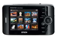
Epson P-2000I’ve been hearing about this little beastie for a while, and Moose even mentioned it by name during my time at DLWS this past November. I’d never actually put my mitts on one, but really liked what I heard. With us — today! — deciding to take a trip next week, I had to move fast. A little trip to Wolf Camera in Brentwood, and I had one in my hand.

My first impressions are good, really good. It’s got a little heft to it, but the specs waaaaay outweigh that: 40gb drive, 3.8″ color screen, plays movies and MP3s… and it does RAW! Yup, it’ll take RAW images and let you look at them or any other image from the camera on the ginormous screen. You can even pump the video out to a TV. Extraordinarily cool! It’s got a built-in CF reader along with an SD reader. It’ll support microdrives, and with an adapter will read almost any other kind of card. This thing just doesn’t lose.

And what good device couldn’t be made even better with a little hacking? There are some hacks — none of which I’ll try anytime soon — to put a 100Gb drive in the thing, yielding a huge amount of storage at a pretty low cost. That’s a project for another day though.

For now, I’m gonna sit back and enjoy this little beastie — it’s waaaaay cool!

It’s a Little Too Quiet Out There

And it is….

Of course, when it’s quiet in the Deuaxmayne, that usually means I’m up to something.  This week’s exercise has been to integrate Photoshop actions, Photoshop commands and Applescript.

Since I can’t yet get RAW images working through JAlbum, I’ve been pondering genning up my own code to do similar page-building, all through the graces of Photoshop and Applescript.  So far, the results have been promising.  Last night, I built a script to take an image and make the web-ready size and the thumbnail-sized images.  Next is to apply filters, apply a graphical watermark — that will be the tough part — and then build HTML around the images.  I’ve probably got another week’s work on the code, and then the photo albums should begin to look better, and be updated more frequently.

Stay tuned!

Canon Upgrades

This morning has the new Canon 30D body showing up on their website.

My initial reaction is…. so what?

In truth, it appears that there’s not a ton of differences between the 20D and the 30D.  A tweak here and there, but essentially the same camera.  I have to say that I’m not hugely surprised.  DPReview has a nice article detailing some of the differences.

With the 5D just coming out late last year, I was pretty sure Canon wouldn’t infringe on its turf by increasing the pixel density on the 30D.  And, given the 1Ds out there, they couldn’t speed up the 20D frame speed.

To me, the 30D is a funny beast.  It does make a few things nicer than the 20D, but I don’t see folks upgrading from the 20D to the 30D.  Maybe if I didn’t already have two Canon EOS bodies, then I’d think about it…..  🙂

JAlbum

At the request of my biggest fans, I’ve been trying to get the photo albums up to date again. The challenge with that has been that JAlbum has not supported RAW images, and that’s all I’ve been shooting lately.

Enter jrawio.

This little goodie knows how to read RAW images, and extend ’em to JAlbum and any other java code. That’s cool, and the missing link and rosetta stone all in one for me. All that’s needed is to add this to the classpath for JAlbum when it runs.

Yeah…….

The most common recommendation for making that change is in the JAlbum.lax file. Well, for a Mac, the JAlbum.lax file doesn’t exist. In Apple-land, the key file is Info.plist, and it lives in /Applications/JAlbum/JAlbum.app/Contents. Before changing it, make a copy!

In here, you’ll find the -Xms and -Xmx parms (which I have now doctored to suit me, 1024M to start, and 1536M as a max), along with the classpath. This is all XML, so it’s pretty clear what to change. So, with my classpath set, and my memory set higher, I tried to see if JAlbum would pull the new jar file into the fold.

It seems to be working pretty well, but it beats the hell out of the Quad G5 for the first few minutes before finally getting moving. And, for the first time since I’ve had the Quad, I heard the jet fans begin stir while doing processing, and I watched the system utilization go to 100% on all the processors. For 170 RAW images, it took about 10 minutes to churn through ’em all which isn’t obscene.

However, the generated images were dark… very dark.  So much so that I couldn’t but barely make out anything in the images.  Ugh……

Back to the drawing board, I guess.

My First Competition

I’ve been quiet over the last few days…. for good reason. I’ve been running around like a maniac preparing for my first photo competition.

Yep, I decided to enter a local competition sponsored by the Professional Photographers Association of Greater St. Louis (PPAGSL). I’d just heard about this competition on Thursday, and frantically started getting ready for it.

Friday, I spent most of the night preparing my image files for print. This competition required 8×10″ images, which mine aren’t really suited well for — my prints are either 8×12″ or 10×15″. So I hacked and cropped, and finally had six images ready for printing.

On Saturday, I took them to Wolf Camera, and once again, they blew out the reds in two of the images. Ugh. Dejected and out of time, I decided I would reprint a couple of them at home, and see if I could do better. Later in the afternoon, I went to Sam’s Club, and discovered that they carry Ilford inkjet papers — really good stuff! I picked up a box, and brought it home to try re-printing the two red images.

All through the night, I printed and printed, and finally got the new paper working well with my printer, and got my two newly red prints done well. Then there was the challenge of mounting them.

The competition requirements dictated a mount board no more than 1/8″ thick. I never could find board that thin, so I used corrogated cardboard. Cheap, easy to cut, but impossible to get a good clean cut with. However, I decided that was what I had to go with — there was just no more time.

Into the wee hours I hacked and mounted until my six images were ready to go.

This morning, I awoke, knowing that the competition was in front of me, and I was nervous as could be… today I would stand toe to toe with “real” professional photographers, and my work would, for the first time, be displayed publicly. I gathered my images, my courage and my car keys, and headed toward the competition.

I met Karen there — she was entered also — and we chatted before and after the program, awaiting the print competition. The time came, and we both sat on the edge of our seats, awaiting the appearance of our work. Here are the six entries I submitted, along with scores and comments.

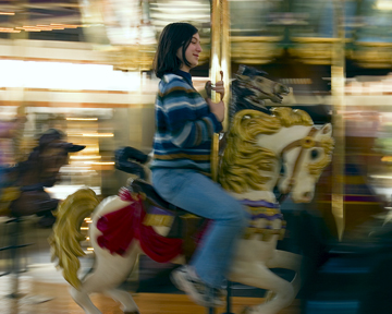
On Her White Stallion On Her White Stallion
Score: 75

None of the judges made any comments about this print. I knew it was probably the weakest, and the score bore that out.

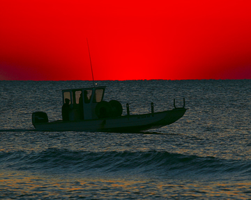
Red Sky at Dawn Red Sky at Dawn
Score: 76

This was one of the images that Wolf had such trouble printing — it looked like a scene from Mars! 🙂 Again, the judges had no comments on this piece.

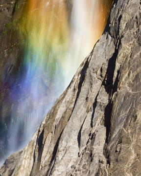
Yosemite Falls Yosemite Falls
Score: 77

This was, I thought, one of my better images. I love the color of the rainbow in the spray from the falls. Again, no comment from the judging panel, but a little better score.

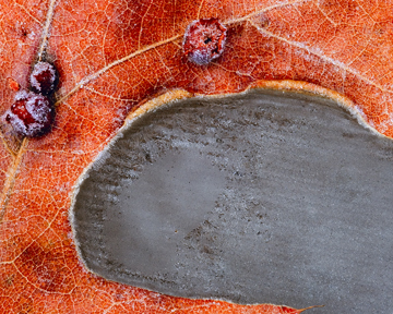
Orange Frost Orange Frost
Score: 79

While this one didn’t generate any conversation, it did make the last cut, and unfortunately, didn’t make it to the final. Still, I think it’s one of the better images I’ve produced.

Snowfire Snowfire
Score: 79

Again, this one made the last cut, but didn’t make it to the final. For this image, though, the judges had some constructive criticism, mostly having to do with the lack of detail in the snow. I’ll be going back to Photoshop with this one to see what I can do about bringing out some detail in the snow.

Color of Fall Color of Fall
Score: 79

This one generated the most conversation among the judges. While examining it, they went through a whole exercise on rotating the image to find what seemed to look best (which, BTW, was not the way that the image was shot). Then there were other points about the bright leaves top and bottom — they appeared much brighter on the print that Wolf created. The comment that sat with me though was one of the judges saying that he “applauded the maker” of this image. That’s cool! Like the other two images scored at 79, this one didn’t make it to the final.

How close was I to taking a position? Well, close. The highest scored item I can remember was around 82 or so. If any of my images with 79 had gone to 80, there’s a good shot I would’ve pulled a 2nd or 3rd place in my group.

This experience has really energized me, and I can already tell that I’m hooked on showing my work. I’m sure there will be more to come!

Printing Photos

I decided to invest a little money and time, and try to figure out with whom I would print my photos.  The contestants?  Creve Coeur Camera, Wolf Camera, and mPix.  I sent/delivered the same image files to all three.  I preferred to print 10″x15″, and only Creve Coeur couldn’t do that, so 8″x12″ was the best I could do there.  Also, I decided to have mPix apply their pearlescent finish to their prints.

To my eye, Creve Coeur was the truest to my original images’ color.  I’m throwing them out of the sharpness decision, as their print was smaller, and artificially sharper as compared to Wolf and mPix.

Frankly, mPix munged the details of the images, almost like they were shot overexposed, and they really trended one photo way toward toward the green.  Given that, I eliminated them.

That left Creve Coeur and Wolf.  I’m finding that folks preferred the Wolf images over the Creve Coeur images, primarily due to the color saturation that Wolf produced with these images.

Pricewise, they’re roughly a wash (extrapolating a 10×15 print size cost from Creve Coeur since they don’t print that size).

Sharpness is tough to judge given that Creve Coeur’s image was smaller, and therefore (theoretically) sharper.

Overall, I’d say it’s a push between Creve Coeur and Wolf.  A slight nod goes to Creve Coeur due to color accuracy and ease of use (web uploads).  A slight nod goes to Wolf due to printing at a size (10″x15″) that makes sense to me.

So now, let’s throw a monkey wrench into the whole thing.

I couldn’t find that any of these guys offers anything but “matte” and “glossy” finishes.  Lustre coating is really the stuff I love — it’s right between the two, and gives my images the look I prefer, at least based on what I printed at Yosemite.  And, there’s an ICC profile for the Epson lustre paper, so in a managed color workflow, I should be able to take my calibrated monitor, along with profiles for the printer and paper, and produce prints that are spot-on the right color with what I see on the screen.  Also, the ink/paper combination is a tested and known quantity, allegedly providing over 100 years of colorfastness.  (Is that a word?)

So in the scenario with me rolling my own, the Epson printer I would prefer to run is the R2400, which allows me to run up to 13×19.  However, for this discussion, we’ll stick with 10×15 since that’s what I printed.  The closest fit in Epson lustre coat paper I could find is the 11.7×16.5, which is just under $2/sheet, and would allow for plenty of border for handling and mounting.  Print cartridges are about $15 each, and it takes seven of them to make an image.  Yield from the cartridges at 5% coverage is 450pgs for black, and 520pgs for color.  Realistically, I would assume much higher coverage, probably approaching an average of 50% per color/black, which takes the yields down to about 40-50pgs for a cartridge — that might even be a little high.  Assuming that across the cartridge set cost ($105), that works out to about $2-$3 for ink, and now you’re at $5/print on the high end.

That’s half the cost of Creve Coeur or Wolf per print, and about 2/3rds of the cost of mPix at the 10×15 size.

Now the Epson R2400 is a pricey printer, but with the savings per sheet (let’s say $4), you’d recover the cost of the hardware after a little over 200 prints.  And that’s assuming you print a lot of stuff, would print 200 big prints anyway (whether or not you owned a printer), and never sold anything.  Obviously, not selling anything wouldn’t be the preferred path!  🙂

I’m not convinced that this would be an ideal combination for running off 100 prints of the same image.  It’d take a long time to get it done, and managing that size of print job would be challenging.  Of course, I’m not likely to go to a photoprocessor and run off 100 prints of the same image at these sizes — that’d be $1k per image, and I’d rather have a few copies of a lot of images than a whole lot of copies of one or two images.

So what did I prove?  Well, I proved that there are vast differences in print producers when you say “don’t mess with my color”.  And I think mathematically, there’s at least a decent argument for a home printer for print sizes up to 13×19 in low quantity runs.

Not much of a decision on who/what the winner is, eh?
iPod Photos

And, in other developments tonight….  I’ve finally purged enough material off my iPod that I can now carry the contents of my “favorites” folder on my iPod.  Cool!

I’m very impressed with the quality of the teency little display — a newer iPod (with video) would be better suited for displaying images, but the display on this little thing is nice enough.  At best, it’s just another means to help me “Sit, Look, Listen. Let Go. Relax. Enjoy. Repeat.”

At least, that’s what the back of my iPod says I should do!